We’ve all been there. We’ve got something due, possibly something we’re not invested in, and we make a choice. The choice to be done on time. The choice not to stress ourselves out. The choice not to do the best work. The choice to…phone it in.
You see it in comics all the time. The pro, the vet, Billy Reliable, all telling themselves ‘No, really, I’m doing the best work of my career, you just don’t get it.’ Whether it’s the legendary son of a legendary son, or the modern father of the Dark Knight, this can affect, at minimum, TWO people. You may have guessed who I’m going to talk about.
When Frank Miller went into creator owned work, he learned a couple of things. First, we’ll buy whatever he puts out, whether it’s the incredibly high quality first Sin City mini series, to the lesser quality, shouldn’t have been in color, final Sin City mini series. Secondly, that we’ll buy any story he tells about why things look the way they do, whether it’s the blocky, chunky figures of 300 that allowed (then wife) Lynn Varley’s colors to shine like double spread paintings, to the blocky, chunky distortions of humanity that happened to us when we read Dark Knight Strikes Again with the horrendous computer colors of (soon to be ex-wife) Lynn Varley. (A class action suit is being brought in the name of those who may have been affected by Dark Knight Strikes Again. If you were a victim of, or attended a school in which, Dark Knight Strikes Again was used, the Stone Group is ready to be there for you…).
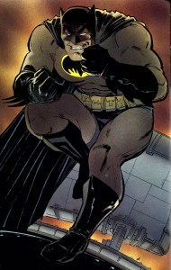
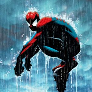
 The same guy drew both of these, and says the second one is better.
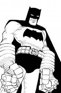
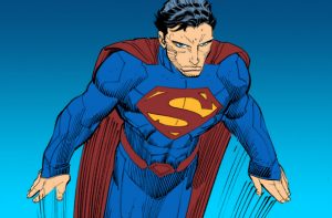
Miller would have us believe that he had reached a pure level of cartooning, that if anything he drew looked like a recognizable version of what he was drawing that the drawing was a failure. Now, I can’t say for sure that money and success had gone to his head. I can say that he showed his mentor Will Eisner the opposite of respect with his Sin City take on ‘The Spirit’, and I can say that his comic work was phoned in.
Next is someone who was built by Marvel to be a superstar. John Romita JR grew up with Kirby at the house, and his dad at the ASM drawing table. He worked hard to learn the language of comics, and if you look at his early Marvel Team Up work compared to his first run on Amazing Spider-Man, you can see improvements in leaps and bounds.
“Dad, dad…put this on the fridge!” hey…that’s not bad!
In spite of his talent, there were editors at Marvel who either hated his work, or hated his dad. He was bounced from title to title, required to do single issues that would take him off of ongoing gigs that wouldn’t come back, and even drew multiple titles per month for a while. He was an old school comic artist’s artist. He did the work, and kept doing the work, no matter what it was. AND, he got better with every project he took on. I’d say he hit his Marvel peak with his run on Amazing with J. Michael Straczynski . His Spidey now was a lean, angular thing, all stretched out, maybe with less in common with his dad’s Spider-Man than with Ditko’s for the first time ever. It doesn’t hurt that it’s a classic run, or that Dean White’s colors were a perfect foil to bring the most out of the art.
Why aren’t these books in print right now?
JRJR also hit a measure of creator owned success with the first big Mark Millar book, Kick-*ss. The first story is great, has some nice finishes from Tom Palmer, but book two…oof. Near the end of that run there are entire issues that look like they were shot from rough sketches of layouts using a camera on the international space station. To call them rough would be insulting to sandpaper. They’re bad, so bad that you can’t find them online with the amount of effort I’m willing to put towards that, but hey, I’m phoning it in too.
Caption- Kick*ss2.jpg file not found, and you shouldn’t go looking for it.
He was still under exclusive contract with Marvel, and working on high profile books like Captain America w/ Rick Remender and Avengers with Brian Michael Bendis. The cracks in the armor were starting to show though. There’s some less than inspired art in his Cap run that’s more or less carried by good writing. Cap’s shield is different sizes from panel to panel, has different numbers of stripes, just lazy business from someone who started as a consummate draughtsman. There is no chance that the JRJR of Contest of Champions would be ok with easily avoidable mistakes like that. He was drawing like a guy who wasn’t worried if he lost his job instead of someone who used to draw like he was fighting for his next one.
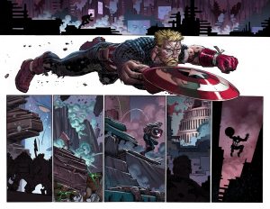 Here’s an example, but this isn’t the worst of it.
DC had a shocked the comic world when they announced that JRJR was now under contract with DC and would be taking over Superman with Geoff Johns. That’s crazy business…the son of John Romita at DC? Marvel must have done him wrong to leave like that, right? “I bet he’ll be rejuvenated now that’s he’s got fresh material in front of him…” I told myself, so very incorrectly. His Superman was a weird mix of foreshortened figures, flying poses that wouldn’t have passed muster in the 60’s, and capes of so many varying lengths you’d think Todd McFarlane was drawing them. For extra fun, he teamed up with Frank Miller who wrote a Superman Year One story that put their declines in full view at the same time! It’s just so confusing when an artist gets to a point where they think their visual shorthand is either fine for public consumption or worse, an improvement over their better work.
Curt Swan he weren’t. With a couple of exceptions on Bat-stories, most of his output at DC was around this level. Whether or not he wasn’t happy with them, or they weren’t happy with him, he’s found his way back to Marvel. What will that bring? So far…nothing to think that ship’s been righted. Please enjoy the Virgin Variant to Moon Knight #1, which someone will pay $200.00 for.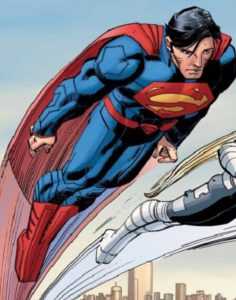
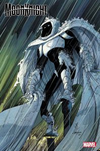
This. $200.00 for this.This, featuring Moon Knight’s famous Reed Richard’s fingers.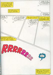
That will wrap this up. It’s sad to see your idols fall, and this is the first place you learned that. If you’ve been enjoying my columns for decades and feel like the last few have been lacking, well…
(I could have included John Byrne in this, but it would have been thirteen pages long. Please enjoy this page from Alpha Flight that was billed full page rate for pencils and inks.)