

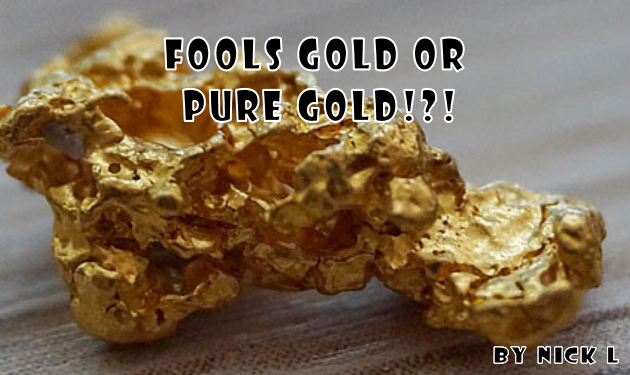
If there’s one thing anybody knows about me, it is that I love gimmick covers. In past articles I have gone over some of my favorites, from holograms, die-cut, foil, to seasonal. But for todays chat I will be focusing on somewhat the opposite: the most out there, straight up foolish covers ever done. Of course, one of the best things about comics is a tendency to push the imagination as far as you can, but these covers may have been best left undone.
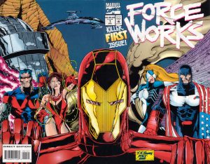
Force Works #1 (1994). Already a seies seemingly no one asked for or wanted, this first issue comes with not only a wraparound cover, but a pop up, fold out cover that jumps out of the front. Truly a neat idea, but generally I find a lot of these where the poster is all bent up or ripped up, making the issue look bulky and messed up in the bag and board. I don’t believe this concept was ever tried again, and perhaps with good reason.
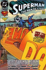
Superman the Man of Steel #30. This one makes the list, not for being terrible, but for its uniqueness. This issue was bagged up, with a cover featuring a blank Daily Planet backdrop and a sheet of plastic colorforms with a great variety of Superman and Lobo in various pieces as well as sound effects and such, which you could adhere to the cover to make your own cover. I spent many a minute trying to dream up various ways to have Superman and Lobo fight on the cover, it was truly well worth the higher price of $2.50 at the time!
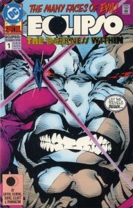
Eclipso the Darkness Within #1. Just awful. When you think of Eclipso, you think of his diamond, so some genius at DC decided it would be a great idea to have a thick plastic diamond for Eclipso to hold, jutting awkwardly out of the front of the cover. Guaranteed to fit badly into your comic box, or to just pop off entirely, its an idea that was smartly never attempted again.
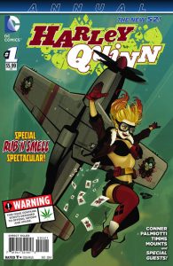
Harley Quinn Annual #1 (New 52). This was a bit of an odd one, as it came out around the end of year holidays, and came bagged to protect its unique feature: scratch and sniff! But it came with two different scents. One was a holiday appropriate “pine” smell. The variant, came with a different smell: that of cannabis. I don’t really know why, they just did it. I’ve never opened my copies to find out just how close they were able to capture these smells, and I would like to say they didn’t attempt this again, but just this year they one upped themselves with another Harley bagged and smell issue, with the future classic “Harley Quinn Fartacular”, thus ensuring that they most likely killed this particular gimmick.
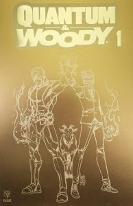
Quantum & Woody #1 (2020). I saved for last a gimmick that isn’t particularly so strange, but certainly generally odd. The 2017 relaunch of Quantum & Woody had featured five variants that all had a different version of typically used foil covers, a computer look foil, fireworks foil, interconnected circles foil, etc. So, for the 2020 relaunch they decided to make what they called a Fools Gold foil cover. The only problem, they decided to make it the 1:100 ratio variant. Now I don’t know if just nobody ordered 100 copies of this title so nobody was able to get one, but from what I understand it was cancelled and never released! Was it due to lack of orders? A sudden lack of access to this fools gold mineral? Who knows, but I don’t believe this gimmick actually exists, making it the rarest of gimmick covers ever.
So, there you have it, the worst gimmicks of all time. Not to say these covers may not be beloved by some (even, perhaps, myself), but they all have varying degrees of accomplishment. However, all of these covers except one are available for purchase on the Graham Crackers Comics website (go figure, I wonder why?), so if you can’t live without these mistakes, I mean, wonders of the imagination, then pop on over and add them to your cart. You won’t regret it. Mostly.